Announcing My Fighter Verses Landing Page
While most of my free-time development focus has been on Elixir apps that don’t use the web, I’ve been playing a lot with the Phoenix framework as well. I deployed one Phoenix app to production in the spring of this year and it has been running great since then. However, it is a site that is built for my family’s use and is not public. I wanted to do another little website that I could use on a regular basis (and others could use as well).
The idea
One of the things I’d like to do more of is memorizing Bible verses. There is a memorization schedule called Fighter Verses that I’ve utilized in the past. There are phone apps and downloads for the schedule. I wanted to be reminded often of this week’s verse and I wanted it to look relatively nice at the same time.
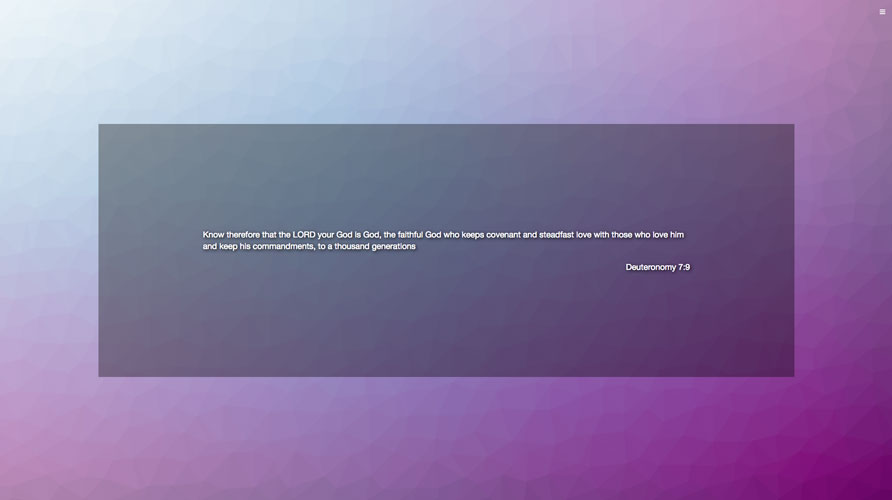
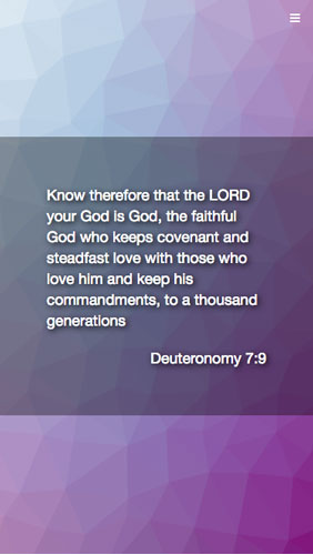
So I thought up this little web app that would present the user with their current verse (based on browser cookies) and use Trianglify to create a dynamic background for each verse reference. It will have no database and is super small. But it is something I find useful that is running on my server.
I have this as my home page in my browser and am also going to redesign the site so that it fill up a whole mobile screen allowing you to screenshot it and use it on your lock screen.
The execution


If you’d like to take a look at it too, go to
geoffreylessel.com/fighter-verses. The first time you visit, a
cookie will be stored in which the site will remember what verse you
are on (they are split up into year:week with 5 years of 52 weeks each).
To navigate, slide out the drawer on the right side of the screen with
the hamburger menu. There is some About information in there as well
in case you are interested.
I designed it first for mobile screens and it kinda stretches out for larger screens. I’m not a designer, so I’m sure some of the design implementation could be improved but it is good enough for me right now to release it to the world.
The issues
There are a few things I’d like to improve:
-
On larger screens, Trianglify takes a while to generate the background and insert it into the html. I think there are likely better ways to go about doing that.
-
There are a couple design nits I’d like to pick and get squared away.
-
The navigation between verses could use improving. If you come to the site and are personally on year 3 week 22, you’d have to hit the next button a lot of times before that verse shows up. I’d like a direct way to get there.
It is shipped
Even though there are things I’d like to change, I’m happy with shipping it as-is. I’m trying to ship things more often and keep myself accountable with some friends at work who are also creators and need accountability with shipping their work.
So go take a look and let me know what you think! I’d love your feedback on anything about it. I’m @geolessel on Twitter and @geo in the Elixir slack group. And if you’re interested in how I got Phoenix being hosted in a subdirectory on my server or how I deploy my production apps, sign up for my email list below and I’ll let you know when I post something about those things in the future.

Buy my book—Phoenix in Action
I've been working hard on the first book on the Phoenix framework from Manning Publications, Phoenix in Action. If you like what you've been reading and/or you have an interest in learning Phoenix, please purchase the book today! Want to know more, check out my blog post announcing the book or the one announcing its completion.

